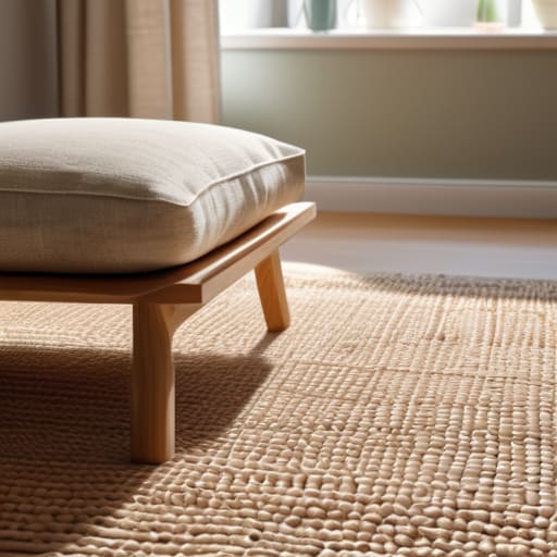
I remember standing in the middle of my first tiny living room, staring at a dozen different paint swatches that all looked like the exact same shade of “eggshell” under the fluorescent lights. I felt completely overwhelmed, convinced that if I didn’t hire a professional designer, I was going to end up with a house that felt cluttered and chaotic. But here’s the truth: you don’t need a degree or a massive budget to figure out how to choose a color scheme that actually feels like home. Most of those fancy design magazines make it seem like a math equation, but in reality, it’s just about trusting your gut and knowing a few simple rules of thumb.
I’m not here to give you a lecture on color theory or suggest you spend a fortune on high-end samples. Instead, I want to share the practical, no-nonsense approach I’ve used for years to make my own spaces feel calm and cohesive without breaking the bank. I’ll show you how to pick colors that work with the furniture you already own and how to create a sense of harmony in every room. Let’s stop the guesswork and start making your home a place where you can actually breathe easy.
Table of Contents
Mastering Color Theory for Beginners Without the Overwhelm
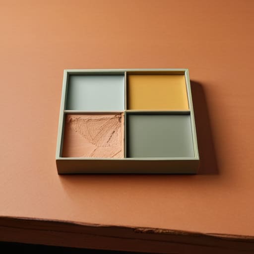
Now, I know the term “color theory” sounds like something you’d only hear in a fancy university lecture, but please don’t let that intimidate you. At its heart, it’s just understanding how different hues play together in a room. When I first started decorating my own place, I used to get so overwhelmed by all the options. What I learned is that you don’t need a degree to master color theory for beginners; you just need to understand the relationship between colors. For instance, if you want a room that feels cozy and snug, lean into warm vs cool color tones by choosing yellows or soft terracottas. If you want a space that feels breezy and calm, go with those cooler blues or soft greens.
Another trick I swear by is looking at complementary color combinations. This is just a fancy way of saying “opposites attract.” If you have a navy blue sofa, a splash of burnt orange in a pillow can make the whole room pop without looking chaotic. If that feels like too much jumping around, don’t sweat it. You can always stick to monochromatic color palettes, which is just using different shades of the same single color. It’s a foolproof way to make a room look intentional and tidy without any of the stress.
Using Interior Design Color Psychology to Set the Right Mood
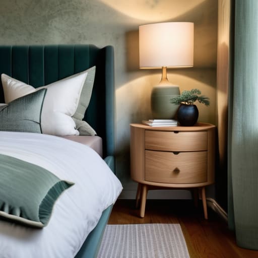
Now, I want you to think about how a room actually feels when you walk into it. We’ve all had that one guest room that feels a bit chilly or a kitchen that just feels too frantic, right? That usually comes down to interior design color psychology. It’s not just about what looks pretty in a catalog; it’s about how those hues hit your mood. For instance, if you’re looking to turn your bedroom into a little sanctuary for better sleep, you’ll want to lean into those cool color tones like soft blues or sage greens. They tend to lower the heart rate and help you settle in after a long, loud day.
On the flip side, if you’re tackling a breakfast nook or a workspace where you need a bit of energy, don’t be afraid of something a little punchier. Warm tones—think soft terracottas or buttery yellows—can make a space feel inviting and bright. The trick is creating visual balance with color so you don’t end up feeling overwhelmed. You don’t need a professional degree to get this right; you just need to listen to your gut and ask yourself, “How do I want to feel when I sit in this chair?”
5 Simple Ways to Pick Your Colors Without Losing Your Mind
- Start with one piece you already love. Whether it’s an old rug from a garage sale or a painting your kids made, let that one item be your anchor. It’s much easier to build a palette around something real than to try and pick colors out of thin air.
- Use the 60-30-10 rule to keep things balanced. I like to think of it as your “recipe”: 60% is your main neutral color for walls, 30% is your secondary color for furniture or curtains, and 10% is that little pop of something fun for pillows or decor. It keeps the room from looking messy.
- Don’t forget to check your lighting. A color that looks like a lovely, soft sage in the bright morning sun might look like a muddy swamp once the sun goes down and you turn on your lamps. Always grab a few small samples and tape them to the wall before you commit to a whole gallon.
- Keep your “busy” patterns to a minimum. If you have a floral print on your sofa, keep the walls and rugs simple. If you try to match every single color in a busy pattern with your paint, the room will end up feeling loud and cluttered instead of cozy.
- Shop your own house first. Before you head to the big box store, look at what you already own. You might find that a color you thought was “boring” actually works perfectly with that thrifted armchair you just refinished. Save your money for the things that actually make a difference.
My Three Golden Rules for Picking Your Colors
Don’t try to use every color in the rainbow at once; pick one main color you really love and lean on neutrals like cream or gray to keep the room feeling calm and organized.
Always test your paint samples in your own home’s light—what looks like a soft beige in the store might look like a bright yellow in your living room once the sun hits it.
Think about how you actually use the room before you commit, because you’ll want soothing blues for a bedroom where you sleep, but maybe a bit more energy in the kitchen where the family gathers.
## My Golden Rule for Colors
Don’t let the fancy design magazines scare you off; you don’t need a degree to pick a palette that works. Just find one color that makes you feel at home, grab a couple of neutrals to keep things steady, and remember that your house should feel like a sanctuary, not a showroom.
Marion Kessler
Making It Your Own
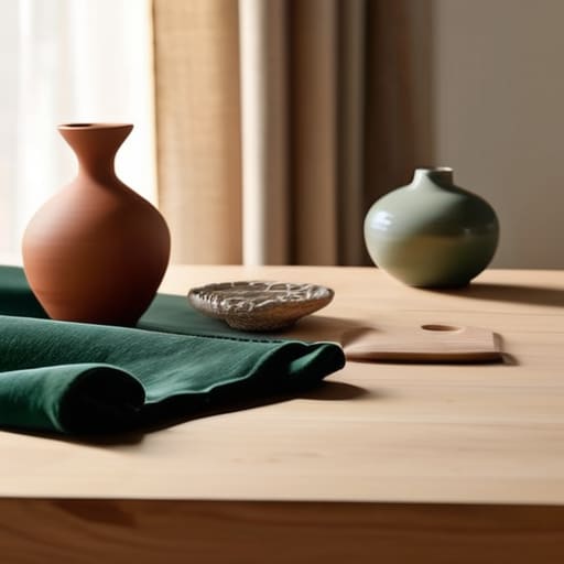
At the end of the day, choosing a color scheme doesn’t have to be some high-stakes design crisis. We’ve talked about how to use color theory to keep things balanced, how to lean into psychology to make your living room feel cozy rather than cold, and how to pick a palette that actually fits your life. Just remember to start with one anchor color you truly love and build outward from there. Don’t feel like you have to follow every single rule in a textbook; instead, focus on finding a balance that feels steady and organized. Whether you’re picking out a new rug or repainting a bedroom, the goal is to create a space that feels like a deep breath when you walk through the door.
I know it can feel a little intimidating to make these changes, especially when you’re working with a tight budget or a small space. But I’ve learned over the years that you don’t need a professional designer to make a home feel intentional. It’s about the small, thoughtful choices that add up over time. Trust your gut, take your time with the swatches, and remember that your home is for living, not just for looking at. You’ve got this, and I can’t wait for you to sit back in a room that finally feels like it truly belongs to you.
Frequently Asked Questions
How do I pick colors that actually work with the furniture I already own?
Look, you don’t need to toss out that old velvet sofa just because you want a “new look.” Start with your biggest piece—the one you aren’t replacing—and look closely at its undertones. Is that beige actually a warm sand, or more of a cool grey? Grab a few paint chips and hold them right against the fabric in different lights. Find a color that either complements those tones or provides a soft, intentional contrast.
Should I be worried about how the light in my room changes the way the paint looks during the day?
Don’t let it worry you, but definitely don’t ignore it! Light changes everything. A soft gray can look like a cold, gloomy blue in a north-facing room, or a warm sandy beige in a sunny living room. My best advice? Buy those little sample pots. Paint a few large squares on different walls and check them at breakfast, noon, and again under your lamps at night. It’s worth the extra hour to avoid a big mistake.
Is it better to go with one big color for the whole house, or should I change it up from room to room?
Honestly, there’s no single “right” way, but here’s how I look at it: if you want the house to feel cohesive and a bit bigger, stick to a similar palette throughout. It takes the guesswork out of decorating. However, don’t be afraid to switch it up in rooms where you want a different “feel”—like a cozy, darker blue for the bedroom. Just try to keep one common thread so the house doesn’t feel disjointed.